
On Being Always Right
Why being right matters to you and how to accomplish it as much as possible, in a landscape of democratized news

What if I told you that a test with 100% accuracy could be wrong almost 100% of the time?
Prologue
Consider a town of ~150,000 people – call it Dunnington – whose New Year’s Eve DUI arrests have increased 300% in the last 5 years. Dunnington parents are incensed by this stat, and a proposal is proffered that would strategically place DUI checkpoints to breathalyze as many drivers on NYE as they can. The checkpoints would employ new breathalyzers that, according to an anti-DUI interest group (IG) driving this effort, find 100% of inebriates. The town likes this and they vote yay on the proposal.
Upon execution of the proposal, by the time the checkpoints reach 1,000 tests, 167 DUI arrests are made. Of those…147 were legally sober! How the heck did that happen?
Internal oversight reveals the breathalyzers – while nailing 100% of truly drunk drivers – had written on their packaging a false positive rate of 15%. This had been overlooked or ignored by the IG who reported the “100% accuracy” stat, which had only referred to true positives. By the time checks hit 1,000 and eventually – due to a now self-inflicted staffing shortage – had to shut down the whole operation for the night, their real accuracy in collecting drunk drivers had fallen to below 12%! And with more checks, their accuracy would’ve approached zero. (I explain this math later, don’t sweat)
In a twisting of the knife, a local analyst later highlighted the number of DUI arrests made the prior NYE had been 6, compared to the 2 arrested five years prior…hence the 300% increase. A new cohort of critics then suggested that the town had set out to solve a problem they barely had in the first place.
The Dunnington voters were operating on the knowledge they had, processed it the ways they knew how, and ended up making a decision they all now agree was wrong. But up until that point, the majority who voted to execute the plan felt they had every reason to be 100% sure they were right – that they had been given a fact that ought to lead to the conclusion they’d drawn. But in reality the information they had was not only uninformative but rather it was misinformative. They were led to take action that not only didn’t help, but hurt.
The relevant information given to the Dunnington voters was all true, but it sharply misdirected them nonetheless. I’ll discuss the errors they made in applying the information in more detail later in this post, but suffice it to say, correctness of fact is rarely enough to draw good conclusions. It’s important to take away, therefore, that even purveyors of true information are not always purveyors of truth.
Producer Problem
Dunnington may be a fake town but the problem caused by the IG’s bad reporting is just a version of a very real problem. Producers of bad information produce it for two reasons:
They don’t know the information is bad because they’re a flawed consumer of it (next section).
They’re motivated to do so by other bad information they’ve consumed.
As in any economy, people who produce information are also people who consume it. As a result, the problem of producers can be largely explained by the problem of consumers.
Consumer Problem
When deception occurs, it’s not always wholly the fault of the deceiver. Consumers can allow themselves to be deceived in two ways:
Passively – by not having the epistemic foundations to discern reality out of new information.
Actively – by not having the desire to discern reality but rather an interest in reaffirming a bias
The problem of passively deceived consumers is more pronounced than ever, due partially to our new paradigm of democratized punditry. Every person with a phone has the immediate potential to produce information for consumers across the country or world. And in a news and opinion zeitgeist that follows a “push” model – where media consumption just seems to…happen to you – a consumer can find it hard to distinguish which of their views were formed of their own volition or just transferred to them osmotically.
The power of a single piece of misinformation is more amplified the more uninformed a consumer is (on a topic). Dunnington’s namesake is a psychological phenomenon where the less knowledge a consumer has on a topic, the more they overstate their expertise in it. The less you know about a topic, the more you don’t know you don’t know. That wasn’t a typo. Unknown unknowns are a big reason why laymen diving into new topics are at great risk of early hubris.
The COVID pandemic showcased this like it was crafted in a lab to do so. A pandemic turned political collided with a pandemic of self-driven home “research” that was highly motivated by personal politics. We saw a network of fresh dilettantes looking for anything that would contradict existing expertise, sharing their findings, and paying little attention to how both their search methods and their findings might already have been debunked for years.
Information selection guided by desired outcomes doesn’t just not inform you, it misinforms you. It misdirects the questions you ask, the places you look, and the people you trust, to the point where you actively make yourself more wrong with time…a characteristic shared with the Dunnington breathalyzers.
What We Can Fix
We likely can’t acutely fix the way an already motivated consumer does intake on a topic. Similarly with producers – in an information economy that rewards them for deception – we aren’t likely to accomplish much by intervening with them either. But we can absolutely influence the information intake of consumers who aren’t yet motivated to learn selectively. And by mitigating deception of any consumers, we mitigate deception by producers.
Per topic, every impassioned and motivated consumer must necessarily have started as a passive one. Whether their first encounter with a topic was from a hot-headed tv pundit, a passionate parent, or an even-keeled report from a moderate news outlet, that consumer was an unopened sponge before that encounter. Preparing consumers who are at that stage with a topic to intake information properly when passive, will help them parse information when more active. It will make their truth-seeking more than just a signal of virtue, but a fundamental framework for consuming information correctly, and ultimately…being right.
Being Right
Being right as much as possible requires the curiosity to know when you’re wrong.
Stop a random Republican and ask them if the 2020 election was stolen, the odds of a “yes” are tragically high. Stop a random Democrat and ask them how many unarmed black men are shot by police each year, odds would have them at least 2 orders of magnitude off…and likely even three. What’s worse, revealing to either of them their mistakes is likely to be seen as unnecessary focus on a fluke rather than a reflection of their own fallibility.
I don’t need to sell readers on the allure of being right, but I do need to sell the value of doing what it takes: discovering when they’re wrong. Real truth-seeking behavior – the kind that makes one right – is often ignored when it’s inconvenient to apply it.
Being wrong, even about important topics, is understandable and normal. But the longer a person is wrong about something, the more of a chance it has to affect them and others. And I don’t just mean the embarrassment of a stranger publicly pointing out their mistake. I mean the higher the chance there is of that mistake causing further mistakes…and at a superlinear rate. If you think the 2020 election was rigged or that over 1,000 unarmed black American men are murdered by cops every year, that’s a big deal…and, if true, it would probably be justified to do more than just vote every 2-4 years.
Wrongness can lead to bad decisions. It can make you eat the wrong food, pick the wrong stock, choose the wrong policy positions, back the wrong candidates, make the wrong friends, say the wrong things at work, and many other unfavorable outcomes.
As consumers, all readers owe it to themselves and the people around them to spend as little time being wrong about important things as possible. To do this, each person needs a willingness to probe their own views and anything that may update those views.
As sympathy for round earth theory waxes and wanes, alongside belief in birds and pandas, there are far more common, more subtle, and less ironic mistakes that smart people are making every day. I’m writing not just for edgy conspiracy theorists, but to all who see their truth-seeking acumen as at least mostly dependable.
Components of truth-seeking behavior like critical thinking, honesty, and rationality are easily accessible when faced with unfavorable claims, but they seem to disappear in the face of favorable ones. Most readers will applaud themselves when applying it but won’t notice when they shirk it. Truth-seeking is strongest when you most want an assertion to be untrue, and is almost miraculously absent in cases where the claim is favorable. Even the most culturally or politically active media consumers will tend toward passive acceptance of stories they like, and if they’re the type to probe at all, will only do so with ones they don’t.
An MSNBC watcher might not like that DOGE achieved something aligning with its goals. So they might then dig into that and find that it’s just a labeling error, almost no benefits were being distributed fraudulently, and the Inspector General’s office (an existing office that does exactly what DOGE purports to do) had already found the error. They might mock DOGE for this. And then the next day, they might encounter a claim about rich people not paying enough taxes, citing the Biden White House’s take (new administration killed this link, sorry!) on income tax distributions. Since that take reaffirms their views on rich people and taxes, no digging would be done and they wouldn’t learn that the White House report measured income incorrectly, causing a massive divergence from reality.
The onus is on each of us to not let this be us.
What determines people’s stances on topics, and therefore where they will and will not spend time probing? Of the many different drivers of personal worldviews, many researchers – most notably Jonathan Haidt of the Righteous Mind – point to tribalism. Membership to political parties and fandom of sports teams are good examples.
If membership to a group is part of your identity and includes having a certain set of opinions, it’s as if the opinions themselves matter less than the membership to the group. A member of a political party may hold all positions necessary to be a valid member of the group but may not know what fundamental values are driving that pattern.
Ask yourself what virtue or principle connects abortion, guns, vaccines, climate change, and gay marriage. Why does one’s stance on any of those topics largely predict their stances on the rest?
When your worldview is shaped by anything other than your own rationale (i.e., group membership), the degree to which you’re right about things will be closer to that of random guessing than that of any analytical thought. When you’re right, it won’t be because you did what it takes to be right, it’ll have been circumstantial…or lucky.
You’ll be wrong a lot, whether you know it or not. And make no mistake – and many of you will – even if you believe your team is right most often and I couldn’t possibly be talking about you, you may not have established any way of knowing that. And that belief, by itself, could be evidence that your truth-seeking behavior really exists in name only.
So how do you improve truth-seeking behavior – the behavior that will make you right? The first step is to want to. That’s the aim of everything above. From there, you can adopt simple heuristics (rules, filters, and pattern-matching) for spotting bad information. You may already have fully entrenched beliefs based on a stack of meticulously procured misinformation – and that will be hard to unstack – but simply improving your ability to spot bad information sources may help prevent further entrenchment, and possibly even help with some unstacking. In the media you and everyone else consumes, there are tricks, misdirections, and – most of all – honest mistakes that propagate wrongness.
So, for the rest of this post, I will do what I can to help prevent that wrongness from transferring to you. I’ll lay out a lot of tricks that both mainstream and “alternative” media can play with facts and data, what to look for, and how to treat them. The process of identifying the issues and handling them appropriately is my definition of the overused term, “media literacy”.
Media literacy
Recall that being right as much as possible requires discovering you’re wrong as early and often as possible. Succinctly, being right requires being wrong.
But you also can’t go around trying to second guess or debunk everything you see and hear. In this new(ish) information economy, a new foundation for detecting bad information with low friction is required. The path of least resistance is to have heuristics for spotting common misdirections that can be found in the media. Whether the misdirections are intentional or not, it’s endlessly useful to be able to spot them without explicitly looking for them – make it second nature. This instinct can be easily learned and can help quickly determine whether a piece of media is worth consuming, whether it needs a little more investigation, or if it needs to be wholly discarded.
To make these misdirections distinct, accessible, and referenceable, I will name them, but note that the utility of these names might end with this blog post.
Lying with Data
There are many ways to deceive information consumers, but the largest category of deception is manipulation with data. Some forms are easily detected by a rudimentarily trained eye. Some are…more devious.
To warm up, I’ll start with one most readers probably know intuitively, and have probably detected before.
Omitted Variables
You might’ve seen this graph before:
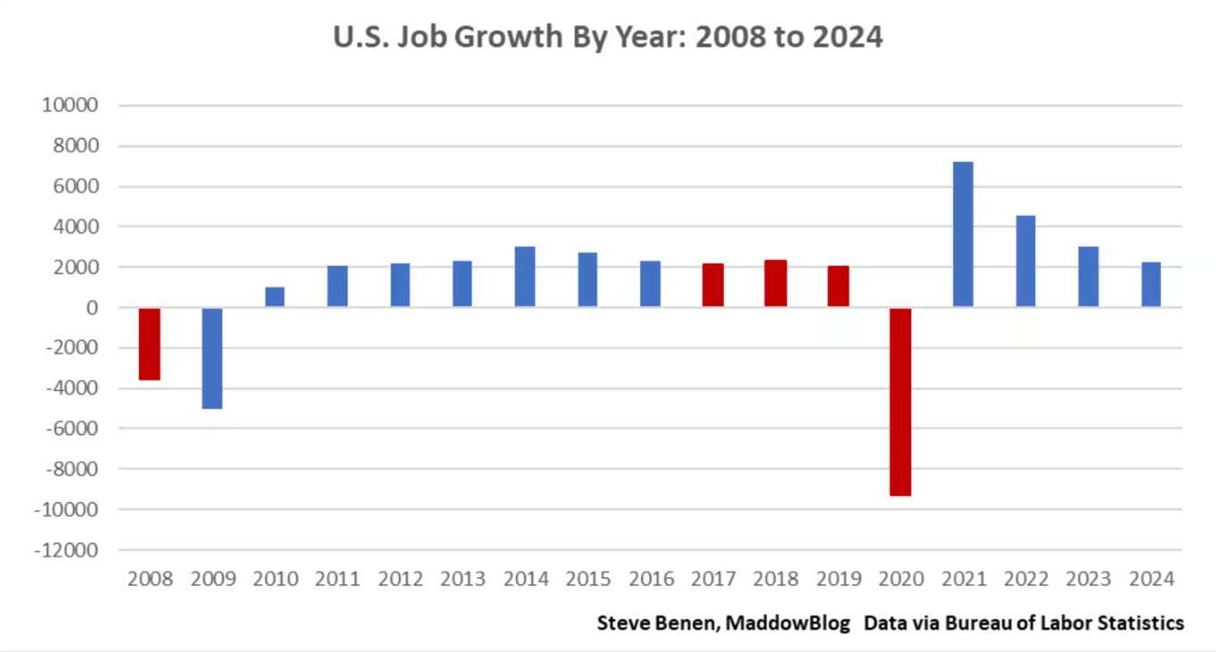
https://www.msnbc.com/rachel-maddow-show/maddowblog/closer-one-looks-better-bidens-record-job-creation-appears-rcna187440
Or this Tweet:
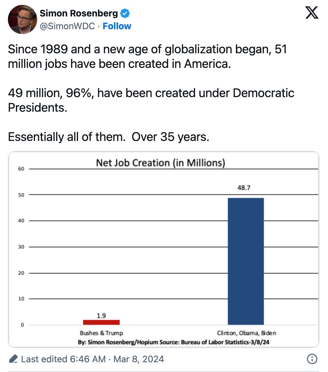
The data shown above – while as true as the information the Dunnington voters got – is a lie in the same way those voters were lied to…by omitting critical information in a way that misdirects our assumptions. Readers likely assume the graph accounts for widely recognized impactful variables, such as the COVID pandemic, which most graphs from this period include. However, it omits both COVID and the 2008 crash (in the first graph), unfairly disadvantaging Trump while benefiting Biden significantly.
Some reporting with this graph alerted readers to the omitted variable in the data but others did not, including the containing MSNBC article. Presenting the graph at all – even with alerting readers to the omission – is dishonest. Many consumers will simply look at the graph without reading the nuance it’s wrapped in. Leaving out that nuance entirely makes this misinformation, and possibly even disinformation.
Even controlling for the pandemic, Democrats are favored by this metric. Why lie? Good news is many people caught this error and sufficiently admonished many of its propagators. The bad news is there are variable omissions less easily caught.
Discounting Age
This one falls under Omitting Variables too but it’s such a common omission that it deserves its own name. I’ll discuss two examples:
1) Total savings:
First, there are a few obvious but overlooked facts associated with age that matter a lot:
Generation sizes vary
Generations tend to get smaller over time (with exceptions for immigration), more rapidly after retirement age
The higher the age, the more time the person has had to do things (like accumulate money)
The below graph demonstrates the first two facts. The third we’ll take as self-evident.
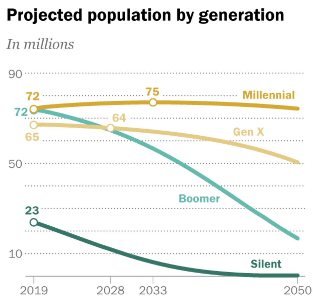
https://www.pewresearch.org/short-reads/2020/04/28/millennials-overtake-baby-boomers-as-americas-largest-generation
Below is total savings for a few age ranges, measured over time. While there is nothing inherently wrong with the way this data is presented, you have to be careful about the insights you can glean when the graph doesn’t tell us how the age groupings were constructed.
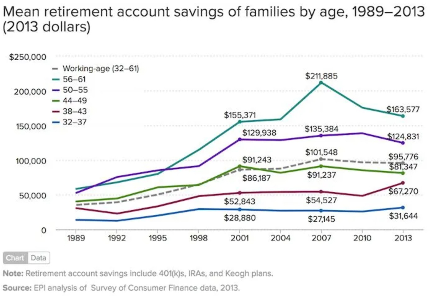
The first intuition should be that the older age groups should (and do) have more money, as they’ve had more time to save it.
However, to derive other insights, there is an important outstanding question which could determine how meaningful this data is. Which property of the groupings was held constant: the age ranges or the groupings, themselves? It’s likely that the age ranges were held constant, given the presentation here, but that would mean that the groups of people contained in each age range will be different year over year. This can affect the calculations quite a lot each year, and enormously over many years.
A different look at retirement savings could be summing across all ages, like total personal savings of the entire U.S. population:
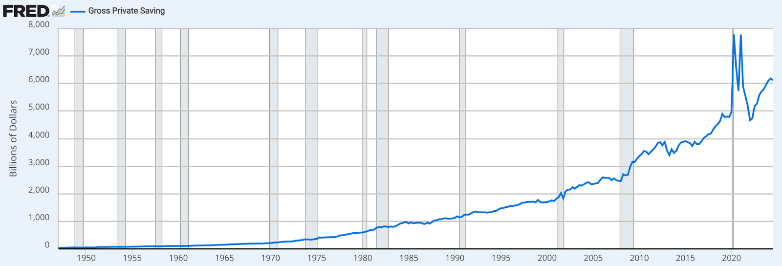
https://fred.stlouisfed.org/series/GPSAVE
Since this isn’t grouping by (accounting for) age, it’s spanning all ages in the population. Contained in this summary are:
People just starting to earn money and should not be expected to contribute much at all
People who have been earning for 30 years and are making the most money they ever have
People who have retired and are doing nothing but spending their money.
Remember that each generation is a different size, meaning that there will be some years where certain generations are experiencing meaningfully different stages of life. For example, the largest generation by birth count, Baby Boomers, happened to be reaching the life expectancy range in the Pandemic years. That fact and the size of the generation will put atypical downward pressure on the line.
The population size of each age or range of ages matters a lot, and it’s often ignored when a non-age variable is of interest. Measuring wealth or income by race is a common example of this.
2) Wealth by race:
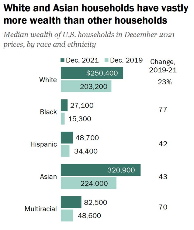
https://www.pewresearch.org/2023/12/04/wealth-gaps-across-racial-and-ethnic-groups/
The example here is one where discounting age could be honest or dishonest, depending on the goal. If the goal is to raise awareness for a problem that needs solving, great. If it’s used to drum up support for certain solutions, that’s less great…because, as I’ll demonstrate, it hides a core variable that could also be looked at to solve the problem.
While there is truth to systemic issues being a factor here – most infamously for black Americans – the numbers typically presented ignore confounding variables, most impactfully age.
For reasons a person who shares the above data might be interested in investigating, the age distribution by race is pretty wonky. White people tend to be older, by proportion, than other races. See the chart below.
Note: The below data is older (Pew didn’t have a newer version of this), but it’s not old enough where the pattern would have changed in more current data.
https://www.pewresearch.org/short-reads/2019/07/30/most-common-age-among-us-racial-ethnic-groups/
The age distribution of American white people is relatively flat compared to American minorities, who trend younger.
Remember the facts we acknowledged about generations before. Those come into play here. The question is how much. If white people tend to have more money, but also tend to be older, how much does age factor into this. Data scientists and statisticians have the tools to control for that variable, so they should be doing that. Not doing that makes these wealth charts misleading.
Raw-Percentage Manipulation
We come to the first error made by the Dunnington voters from earlier, which I hinted at in the story: learning percentage change without knowing the population size that changed (DUI arrests). Telling a town of 150k people that their NYE DUI arrests have gone from 2 to 10 in 5 years is a lot less alarming than telling them about the percentage increase. Choosing the equally accurate but more alarming version to scare people into moving with you is a sneaky trick and it’s unfortunately ubiquitous.
Be mindful of percentage change statements from all sources. Judging their utility should become second nature. Common areas to see percentage change stats: economy, demographics, crime and incarceration, foreign aid, and climate. It’s ultimately up to you to decide where they’re appropriate.
Base Rates and Counterfactuals
Base Rate Fallacy
I’m using the technical term for this error because it might be the most attributable to wrongness, by severity. And that’s why I’ll be laying out several examples.
The second major error the Dunnington voters made – after mistaking a large percentage increase for a large absolute increase – was accepting the “100% accuracy” claim at face value. The problem was a) not knowing there were multiple ways to interpret that metric, and/or b) not considering the base rate – the ratio of actually drunk drivers to all drivers – and how it applies.
For binary tests like breathalyzers, accuracy depends on considering the base rate by evaluating both the true positive and false positive rates and assessing impact based on those rates.
The base rate in the hypothetical happened to be 1 in 50. 2% of drivers were actually drunk. Let’s break down what we know now:
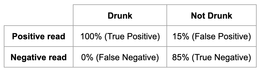
The base rate is 1/50 inebriates and the stops made were 1,000:
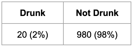
Stopping Dunnington voters randomly yielded this result:
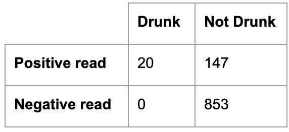
Assuming every positive read was brought in, they brought in truly drunk drivers at a rate of 20/167…or ~12%. That’s really bad. And if you’re still with me, that rate only gets worse with a larger sample size (more stops).
That was a hypothetical town with hypothetical specifications. But this type of thing happens in the real world too. A very similar version was rampant in the 1980s-90s airports. Drug testing had high false positive rates, and you already know what that means for a population that largely isn’t carrying drugs. And more recently, people who were against the COVID vaccines made this error when they reported the number of infected vaccinated people, thinking that was evidence the vaccines didn’t work.
Before moving on, see if you can identify the base rate there and how it wasn’t considered.
Clearly the use of the word “accuracy”, while technically not a lie, effectively was. When the voters hear “99% accurate”, they’re thinking 99% of stopped drunk drivers will be brought in…and 99% of the people brought in will be drunk. They’re certainly not expecting 88% of detainees to be sober…or worse.
Simple word play can flip your desired outcomes on their head.
Missing Counterfactuals
In my experience, our fellow voters run into this one a lot when evaluating the cause and effect of a change in the economy. A counterfactual is essentially what would’ve happened had the thing you’re evaluating not occurred. Comparing reality to theoretical or approximated counterfactuals can approximate the real impact of a change.
If you introduce COVID vaccines into a population, how does it affect death rates during the pandemic? Maybe you could compare that in many different populations, like countries…or states who administered it differently.
Consider an economic intervention like adding housing units, where prices of houses then fall. Were prices already going down? If so, does it seem as though they went down faster even accounting for the pre-intervention downward trend? In some cases, there are economic models publicly available that have predicted counterfactuals. You can use that as your estimate to compare against. For example, researchers have models that predicted COVID deaths without the vaccine. By comparing that counterfactual to reality, they can approximate that the lives saved by October 2021 were ~140,000…according to a specific study.
Over-Generalized Likelihood (Ecological Fallacy)
One of the most widely memorized stats in America since 2020 is “black men are 3x more likely to be shot by police than white men”. Similar to the wealth by race stat above, this stat can be used for honest and dishonest purposes. If the citer of the stat wants to highlight an affliction on black men that we need to investigate the causes for, it might be worth referencing. The stat does inform us on a population outcome, which can be good to know…as a first look. But if the aim is to advocate for specific solutions to a problem, the use of this stat becomes inappropriate and misleading. It highlights a racial cause for the disparity where they may be very little or none.
In this case, if you include other variables, you quickly learn that socioeconomic status plays a huge role. Arguing that socioeconomic status is also a product of race is fine, but it’s a separate claim that should be analyzed as such. It’s important to note that a black man who lives a life of crime in the projects of Chicago is much more than 3x as likely to be shot by police than the average white man. They are much more likely to be shot than the average black man as well.
Controlling for neighborhood, alone, reveals that someone can be upwards of 27x more likely to be shot by police than someone in a safer neighborhood. And that’s before you control for behavior…which is obviously the largest predictor of being shot by police. If you can stay away from criminal behavior, your chances of surviving the police increases dramatically.
Obviously, I understand that innocent people can be stopped by police and the interaction can lead to a killing, but that’s an incredibly rare occurrence. This harkens back to the left-leaning over-estimate of unarmed killings by police.
If that doesn’t work for you, consider this. Roughly 1/5th of the world’s population is Chinese, but a white American couple doesn’t have a 1 in 5 chance of biologically parenting a Chinese baby. It’s a ridiculous example to clearly illustrate the point.
Account for confounding variables!
Truncated y-axes — does it go to zero?
If you haven’t seen this, it’s a funny one:
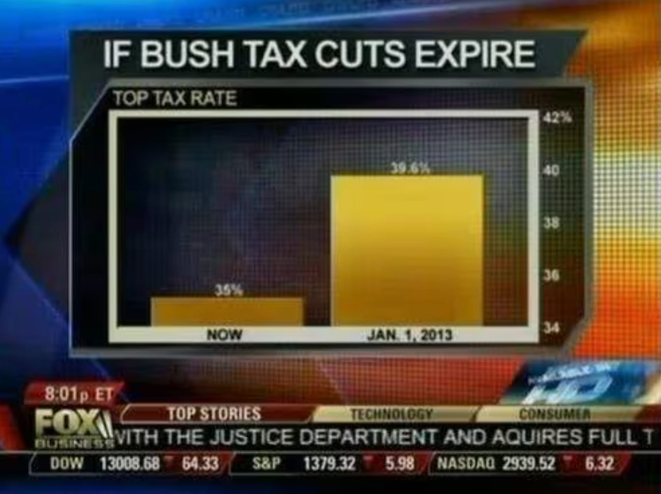
Notice how the y-axis in the bar chart starts at 34%. Not starting at zero makes it a “truncated y-axis”. There are good reasons to truncate axes for visual ease but this is not one of them. This chart is clearly trying to make a point that can’t actually be made with the data, so the visualization has to trick the viewer, under the guise of visual convenience.
In this one, the axes have been made invisible to you!
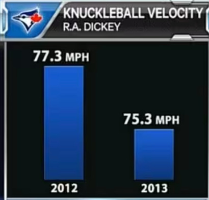
Another sneaky one. It’s a low stakes trick, ultimately, but is nonetheless a good example of truncating a y-axis. You have to notice this for yourself by observing the scale. The 2012 number is about 3% larger than the 2013 number but is visually about 100% larger.
Sneaky Logging
When some data sets are exponential, they’re difficult to visualize. Making the scale of a visualization logarithmic can make it easier to visualize – common in finance and population studies. While often useful, it can also be used to downplay changes in data.
To identify when logarithmic scaling is used, check the y-axis for values growing exponentially (e.g., 10, 100, 1000). It’s up to you to decide whether the use of it was done for clarity or misdirection.
Numerators and denominators
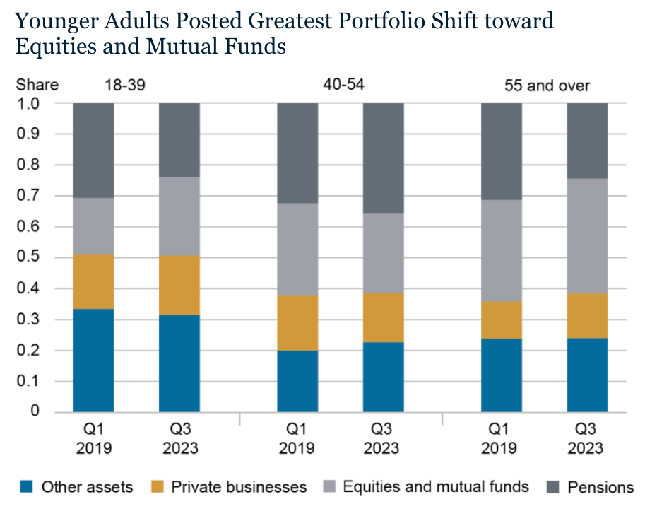
Another data manipulation to be aware of for the purposes of identifying intent is presenting change in proportions. The below image isn’t a misdirection at all but I wanted to use it to discuss what it means and how to think about conclusions that come from data like this. The chart shows how types of wealth changed proportionally for different age groups over 4.5 years.
https://libertystreeteconomics.newyorkfed.org/2024/02/wealth-inequality-by-age-in-the-post-pandemic-era/
When dealing with changes in proportions, unless told explicitly, it’s impossible to know which raw numbers changed. Did numerators or denominators change? Where a numerator would be the type of asset/wealth and the denominator would be the total wealth (of the age group). For example, the proportion of equities and mutual funds grew for the youngest group quite a lot. Does that mean the group transferred money from one asset type to another (reducing the numerator for one and increasing it for another)? Or maybe it means their total wealth grew and that type of asset grew the most? Or maybe the other assets relatively decreased in value on their own? Or some combination of those.
Again, impossible to know here. But knowing how this type of data and this type of visualization work is important for evaluating conclusions made from it. For example, if someone used this to tell you that young people are increasing their investment in equities over time, that might be intuitive, but isn’t necessarily the case. Best to ask for the underlying numbers to verify, or take that claim with a grain of salt.
Inconsistent Metrics
This one’s easy. Just watch out for presentations of data that compare two different metrics, like mean and median. If you’re being shown that wages have increased over some period of time and the presenter compares a median wage as the starting number and a mean wage for the number at the end of the time period, that’s invalid. Or perhaps they use two different time periods. Also invalid…but irritatingly common on social media.
Inconsistent Sources
Beware of claims using different sources for start and end values in a time comparison. If the underlying data differs, the comparison is invalid. If the source changes but the data remains consistent, it's fine—just verify. Reliable reports will cite sources for transparency.
Other Misdirections
Suspiciously Specific Sampling
This one is a trick that takes advantage of a familiar statistical error, relying on unrepresentative samples. For those not immediately familiar, an oft-referenced poor representation of a population is the ratio of men to women in STEM (U.S.). That ratio is unrepresentative of the U.S. population, such that using data from the STEM population would say little of the entire U.S. population.
While intuitive, this misdirection is nevertheless performed by even the people we hope do it the least. In an interview with Jake Tapper of CNN, Steven Miller, a top political advisor to President Trump, was arguing a point that relied on a claim that the federal government was historically very left-leaning. The claim was that 98% of the workers at the agency, USAID, had donated to left wing candidates. That was meant to imply that the entirety of the federal government was similar.
The reason this is “Suspicious” sampling is Steven Miller is a member of the federal government that can obtain this type of data for all agencies. To pick one agency to use as a representation of the whole is not only surprising, but – if not malicious – random. To pick this agency – once you know that it’s a famously progressive agency, designed for progressive things, and founded by Democrat president, JFK – it’s not just a bad sample, it’s a precisely and selectively bad one.
That said, suspicion isn’t fact. When you come across Suspiciously Specific Sampling, it’s up to you how much weight you want to give the claim at all.
Non-falsifiability
Our media environment is wrought with claims of differing validities. But a type to watch out for, even before investigation begins, are claims that are unfalsifiable. In other words, effectively not testable. A practical way to think about testability is whether a test for the claim’s truth can be conceived of at all.
I’ve noticed a cohort of the far left claim that socialism is a better system than capitalism, and to fend off arguments against that, they assert that the failed instances of socialism were never truly implementations of it. If you find that every piece of evidence that might refute a claim is discredited as not real evidence, especially if the claimant would have favored that evidence had it gone their way, you’re in unfalsifiable territory.
Akin to the socialism “paradox”, there is an uncomfortably common Trump argument that falls into this unfalsifiable category. In his first campaign, Trump’s base considered him the only possible savior from a cabal (“deep state”) of elites dead set on destroying the country. When most of the cabinet he picked for himself eventually turned on him – even people he replaced some of those people with – 100% of those people were pinned as part of that same cabal.
Ignoring the contradiction of the savior from the deep state picking deep staters to advise him, the argument is set up in a way where evaluating Trump at all becomes impossible. Thereby making the argument worthless to a person seeking truth.
Lying By Omission
Many outlets do this. Possibly all of them. The accuracy reporting of the Dunnington breathalyzers was a lie of omission because it betrayed common sense and left out half the measure of “accuracy” that anyone in their right mind would’ve wanted to know.
In the real headline below, the same thing occurs.
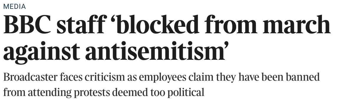
https://www.thetimes.com/article/bbc-staff-blocked-from-march-against-antisemitism-68jwmjj9d
Our assumption as readers is that a reporter will tell us specifics when they’re meaningful. In the case below, specifying that staff was blocked from a march against antisemitism is true…but the reality doesn’t reflect what the article is attempting to get you to think.
The Times is aiming to make you think the BBC has a bias against anti-antisemitism marches. Said stronger…that they might have a bias toward anti-semitism. In reality, BBC has a “no bias” rule that prevents their staff from joining any political march like this. They also prevented them from attending similar marches for LGBT pride.
Reporting on this at all sends the message that there is something worth reporting. That leads the reader from the jump. What’s worse is, the message intended here is untrue. This is a form of deception.
Never forget…selective information can make you less informed than uninformed.
Conclusion
In a world where everyone ostensibly wants truth, but most don’t want to seek it when there isn’t an immediate reward, it’s useful to reconsider why being right is so good…not just for all of us, but for oneself.
Being right can manifest as merely discerning fact from fiction. But rightness of fact can lead to improved rightness in more derivative conclusions — magnitudinal and probabilistic rightness.
You want your facts straight, of course, but what about making good predictions about the world? You can’t know for sure what a politician will do in office or how your favorite quarterback will perform next game, but you can be more right more often about things like that, by being right about the premises on which those predictions are based.
The idea that we live in a toxic media environment is a belabored point, but hearing and understanding those arguments is wholly different than really feeling how sneaky media can be.
The point of learning about the various tripwires in our media landscape is to a) raise awareness to where misdirection might’ve been going unnoticed, and b) enable consumers to discern fact from fiction with less friction. But ultimately, it’s to help consumers build a worldview that is more useful to them. One they can use to make better decisions in all domains.
Being right takes some humility that isn’t second nature to most people, which means — as easy as some of the learnings can be — it requires some intentionality.
I hope that readers take away a desire to be intentional about that. And I hope they take away an understanding of the pitfalls when they’re not being intentional about it. And lastly, I hope the tips on the pitfalls were useful.
I plan to write up deeper dives into some of those concepts but I wanted to get out this longer piece as a first foray into my very own online punditry.
Best of luck out there!